
CONTEXT
Bachelor's Thesis
ROLE
IX Designer
TIMELINE
Feb 2025 - Jun 2025
CONTEXT
Bachelor's Thesis
ROLE
IX Designer
TIMELINE
Feb 2025 - Jun 2025
Developing a tool for archival practices tailored to users involved in participatory heritage initiatives, through a participatory design process.
During my thesis fieldwork in Dalby, I engaged with the local history community and found that amateur historians often struggle with two things: managing archives without proper tools, and understanding how stories and records connect. This led me to explore simpler, more visual ways to manage archives and highlight those connections.
Users: Amateur historians, primarily in their 60s-80s.
Goals: Streamlining their archival processes and digitally illustrating the connections between historical events.Yadda
Pain points: Users struggle with cumbersome archiving methods and scattered data across multiple platforms, and they don’t have tools to easily visualize how historical records are connected.
As is common in participatory design, the process began without a clear problem statement. Challenges emerged through field research, starting with five semi-structured interviews.
These informed a more focused exploration, including desktop research on digital archive solutions and one participant observation session with an amateur historian. This led to the following insights:
Too many tools, too little time: Users tend to juggle a lot of tools when carrying out their archival practice, with data often being stored in a plethora of different places.
All the same type: Simultaneously, there existed a lack of tools for visualising history as a "bigger picture" of connections in history.
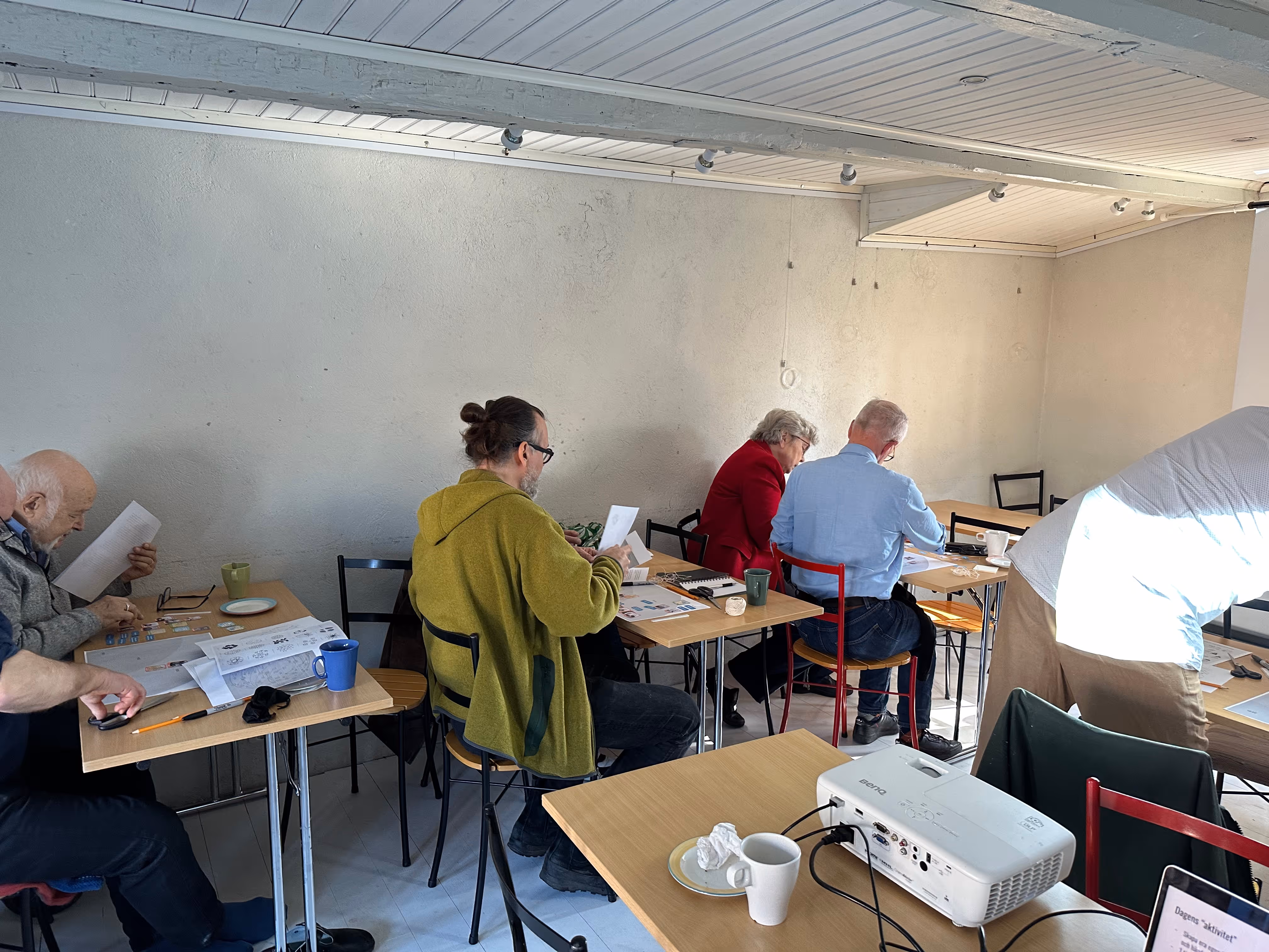
After my field research, I ran a workshop on visualising history to explore how people connect with the subject. I shared a short lecture, curated materials, and recruited participants via social media.
Using insights from the workshop, I sketched ideas, built wireframes in Figma, and developed a high-fidelity prototype with JavaScript and X6.js.

The purpose of the user testing was relatively straightforward, with the goal being to evaluate how intuitive, valuable and functional the protoype was in supporting the workflow of amateur historians.
Using insights from the workshop, I sketched ideas, built wireframes in Figma, and developed a high-fidelity prototype with JavaScript and X6.js.
The current iteration relies on principles found in data visualisation and flow charts for the structuring, connection and storing of historical records, and has implemented several key feedback points from user testing.
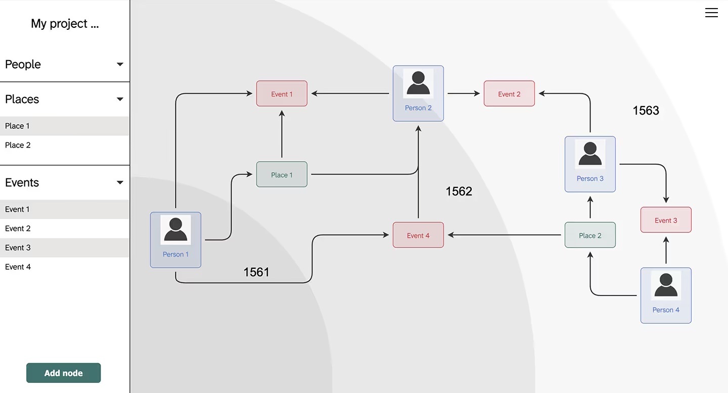
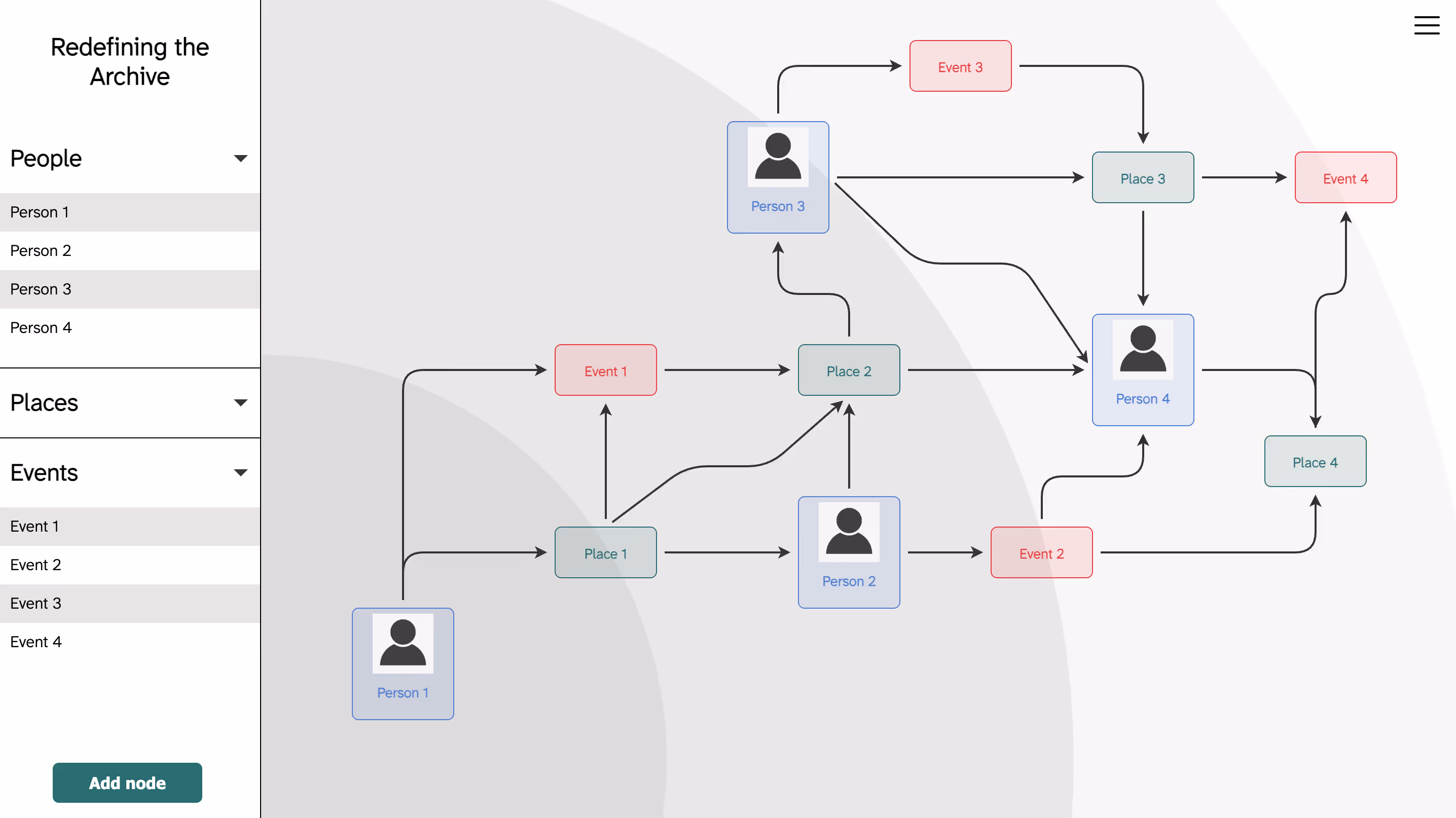
An example network made in the tool.
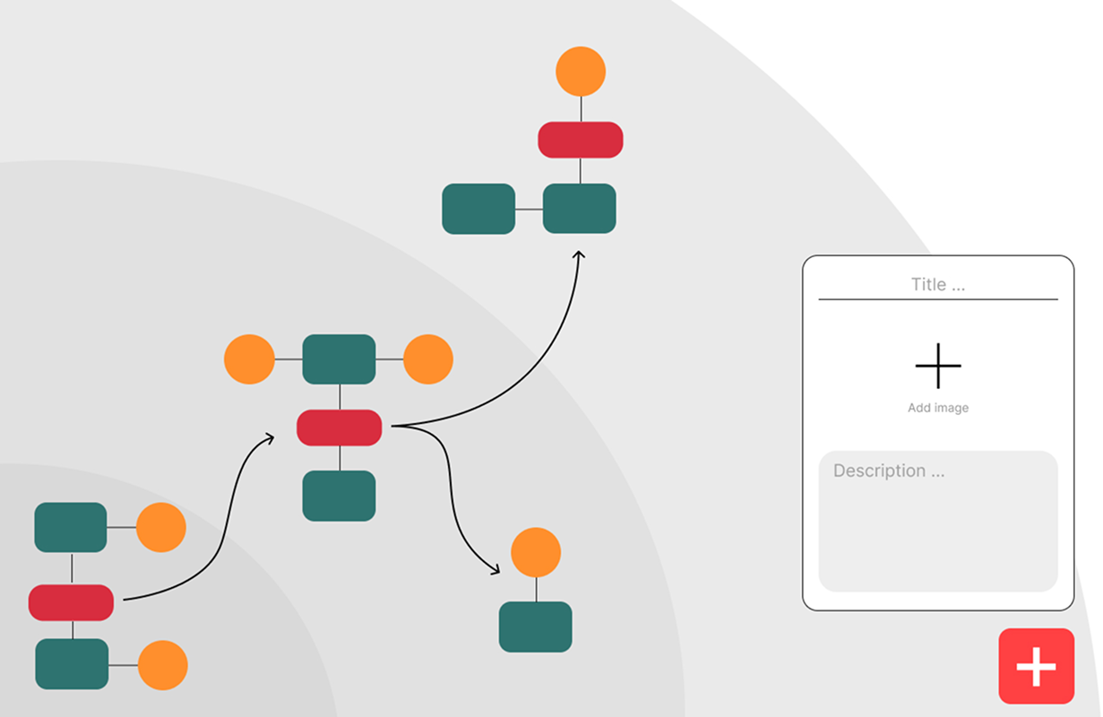
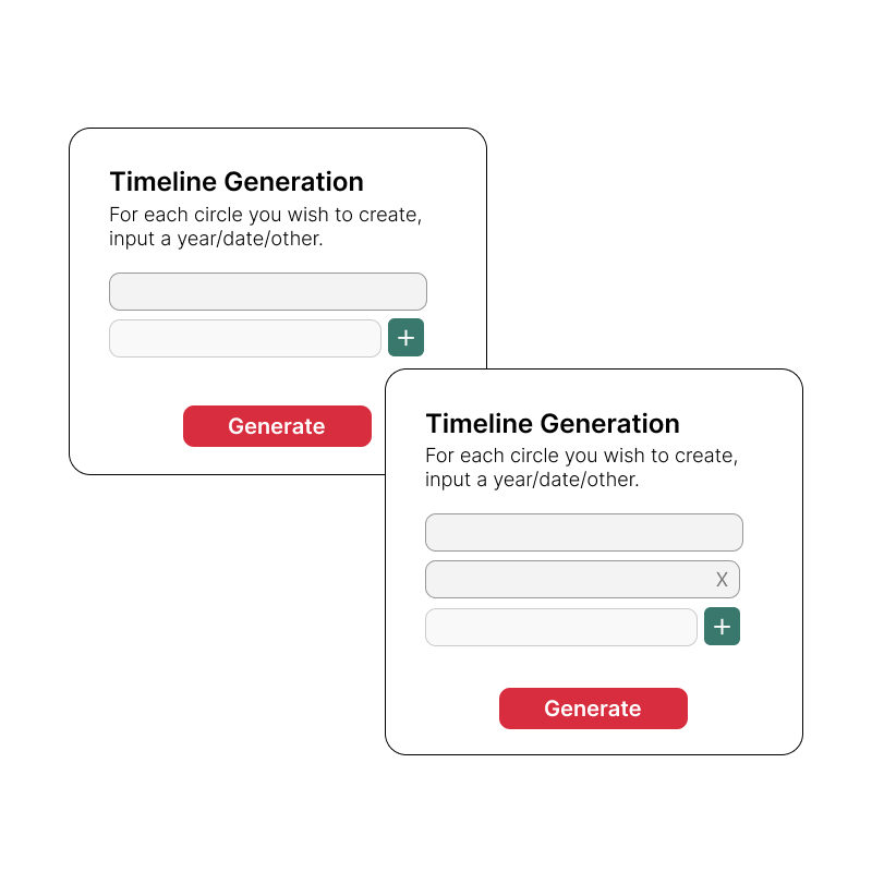
The user can quickly generate a timeline consisting of concentric circles–a non-linear representation of time.
When creating a node, users choose from three categories: People, Places, or Events. They can also add an image and description, which are stored for later reference.
Connect nodes by clicking and dragging between the "ports" of the nodes you want to connect. Add vertices by clicking the connector.

Recruiting participants was a challenge, especially with limited resources to offer in return beyond gratitude and, in my case, a fika. It took more time than expected and cut into what I intended to be the prototyping phase.
However, once things got moving, the process became incredibly enjoyable. The participants were enthusiastic and brought valuable, real-world insight that deeply informed the design decisions.
While I was initially drawn to designing a very visually rich interface for the tool, to make it really "pop". However, I quickly simplified the UI, realizing that the core users were familiar with tools like Excel. A simpler, more familiar design would ensure a smoother learning curve.
To save time, I used the X6.js library for core interactions. As most of the documentation was in Mandarin, AI became an invaluable tool in translating as well as tailoring the documentation to my needs.
However, X6.js wasn’t ideal for this project, and with more time, I would have built the prototype from scratch for better fidelity and features.